“We are our choices” Jean-Paul Sartre
Time was when the size and layout of a mixing console were a function of whichever recording medium it was strapped to. Simpler, sepia-tinted times of 16, 24, 32 or 48 channels. Innovations such as Harrison’s inline layout helped rationalise mixing surface real estate as track counts passed 24 but it’s fair to say that analogue mixing desks were big, and that was how it had to be.
Track counts grew and grew until eventually everyone just stopped counting. Colours are the new numbers.
 This all started to change with the advent of recording audio as a stream of 0s and 1s. Digital introduced the possibility of physically separating the knobs and faders from the audio signal path. No longer bound by the capabilities of the multitrack recorder, consoles and control surfaces have persevered adorably with the eight-times-table (without which all hell would surely break loose), but today are set free to be whatever they need to be.
Assignability and automation were two staging posts along the way to where we are now. The window was the same size, but you got to choose the view. Then modularity came along and let you change the size and number of windows without moving house. The shift to having both audio and control on IP finally opens up the best of both worlds. With surface, software, engine (DSP) and i/o distributed you can now change the size and shape of the window almost limitlessly, your view of the multitrack and plug-in world can now be as small or large as your room and / or budget allows.
“Choose Life. Choose a job. Choose a career. Choose a family. Choose a fucking big television…” – Mark ‘Rent Boy’ Renton
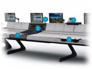
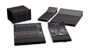
For the post production world it could be argued that in physical terms the launch of Yamaha’s Nuage in 2012 and Avid’s S6 in 2013 took us the rest of the way. Still offered in multiples of 8 (let’s not tip the earth off its axis), here are essentially platforms on which to construct a surface, where the specifications are up for grabs both horizontally and vertically to some degree. How many faders, how much blank space, how many knobs and buttons, if any, and in which order? Do I need displays? What if I change my mind in a year? What if I don’t even want to use the manufacturer’s standard frame and metalwork?
Up until quite recently – some might say up until this era of homogenous globalisation – every Brit on their first trip to America would upon their return, without fail, regale friends and family with stories of the overwhelming choices confronting the hapless tourist ordering something as mundane as toast. Whole Wheat, Rye or Sourdough? they’d say in their best Cagney accent (not Cagney as in Jimmy, Cagney as in & Lacey).
While on the face of it that has little to do with control surfaces, it has everything to do with human behaviour in the face of choice.
There is a famous study, conducted by Professor Sheena Iyengar of Columbia Business School (Professor Iyengar is widely regarded as the world’s leading expert on choice). In this experiment, a line of high-quality jams was set up in a food shop. Customers could taste samples and were given a discount voucher should they choose to buy a jar. Some customers were exposed to a range of 24 jams, others to only 6 jams. 30 percent of those customers exposed only to 6 jams actually bought some, whereas only 3 percent of those faced with all 24 varieties made a purchase. Leaving Professor Iyengar with no choice, ironically, but to conclude:
“The expansion of choice has become an explosion of choice. Too many choices can overwhelm us and cause us to not choose at all. For businesses, this means that if they offer us too many choices, we may not buy anything.”
The intriguing twist is that 60 percent of customers in the store were drawn towards the large display, but only 40 percent showed any curiosity in the smaller setup. We like the idea of choice, sure, but it can be debilitating, can paralyse our decision making.
Which brings us back to modular control surfaces. The open-ended options presented by today’s control surface technologies are without question a good thing. Not just because one size doesn’t fit all, but because things change. New formats, new deliverables. It’s not an uncommon hope that the mixes you’ll be working on next year are bigger, better, higher budget and more complex. OK, forget the higher budget part, but the point still stands.
 It’s too simplistic also to argue that too much choice is a bad thing. The trick for both the buyer and seller would seem to be to avoid information overload, to present interesting choices in the right way. The key to making the right choice is to see your options clearly before making your decision. Easier when you were deciding whether to add 16 faders in 1995, not so straightforward when every element of your control surface is flexible and your minute-by-minute efficiency will be adversely impacted by getting it wrong.
As a product ranges grow to include additional modules, the job of specifying the ideal set up is further complicated. One could always throw together the right modules to make a good-looking desk, but would it work?
Luckily the tools that help us decide have evolved. From posters, brochures, 3D schematics and online configuration tools, we get increasingly detailed and real perspectives.
Higher levels of system modularity also lend themselves well to the after-market. Sites such as Resurface, and a close working relationship with a trusted reseller partner, offer a secondary market place if needs change and we wish to add, remove or trade options from the initial configuration. We’re not quite in the world of realising our personal signature series console design through VR and 3D printing, but there is no doubt we’re a lot closer than we’ve ever been before.


